I found a way to cheat. I take my small digital camera into the fabric shops with me to help me pick out the colors. I lay the bolts down and take a photo in the “black & white” mode so the color is stripped and all I see are the darks and lights. I wish that I had figured this out a long time ago.
Here is a photo of my husband’s quilt (pattern from “Heather’s Quilt” at <http://www.kerrysgarden.us/christmas-quilts/>) which is now going to be the back of the quilt because it doesn’t have that “pop” that I like. It was supposed to be 3 dimensional.

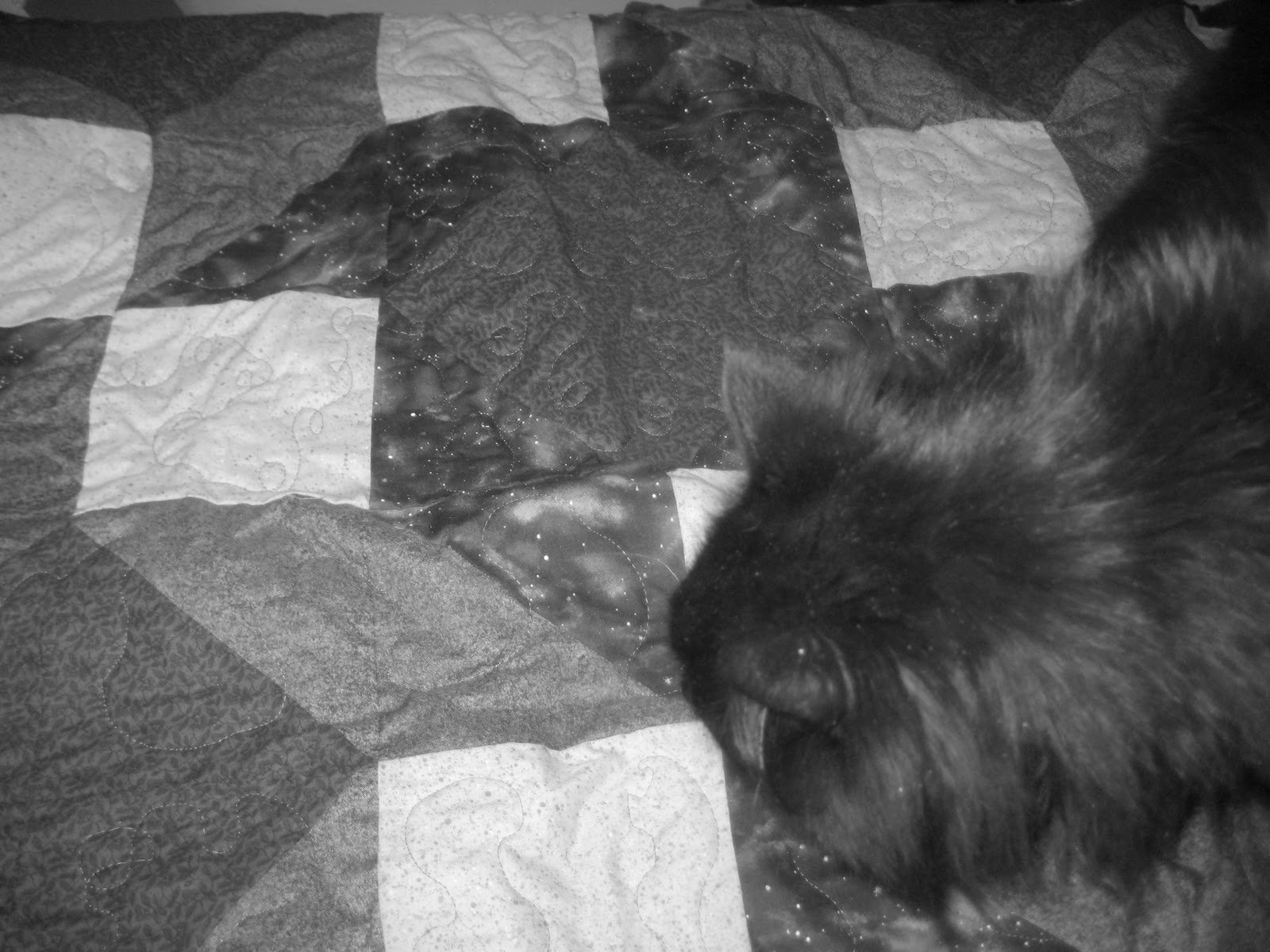
Now look at it in the black and white mode. Can you see the lack of contrast? (Also, note the quality inspector specializing in comfort judging my work. The cat takes his job very seriously and I knew the quilt passed when he curled up to nap.)
The red and blue are nearly the same in value. That negates the three dimensional effect that the quilt would have had.
The new front of my husband’s quilt is the Attic Window Pattern, another 3-D effect. (I like to make my quilts reversible. I’m spending money on the back material, might as well make it interesting.)

Here is the image in black and white. There is more contrast creating interest for the eyes, even if you ignore the images in the window panes.

Now, here is my niece’s quilt top. She picked out the pieces and this was before I figured out the camera trick, otherwise, I might have suggested a deeper color of pink for the light side of the pane.

The quilt is static instead of dynamic. It is the Attic Window Pattern, but notice that there seems to be little contrast between the pain and the light side of the window edge. It could have been dramatic or more interesting, in my opinion. (I did not add a sashing because it was one of the first Attic Window Patterns that I found. It never occurred to me at that point to add the sashing until I ran across some later that had the extra material and I liked the results. I'm basically a beginner quilter.)
Look at the image with the color stripped. You can see the contrast, but the pane and the bottom are too similar in my opinion. The colors work wonderfully together, but the contrast isn't there for the window edge. It is very mild.

These are all UFO (UnFinished Objects). I have to finish them!
